We have introduced various functions for time series graphics including
autoplot(),gg_season(),gg_subseries()andACF(). Use these functions to explore the quarterly tourism data for the Snowy Mountains.snowy <- tourism |> filter(Region == "Snowy Mountains") |> summarise(Trips = sum(Trips))What do you learn?
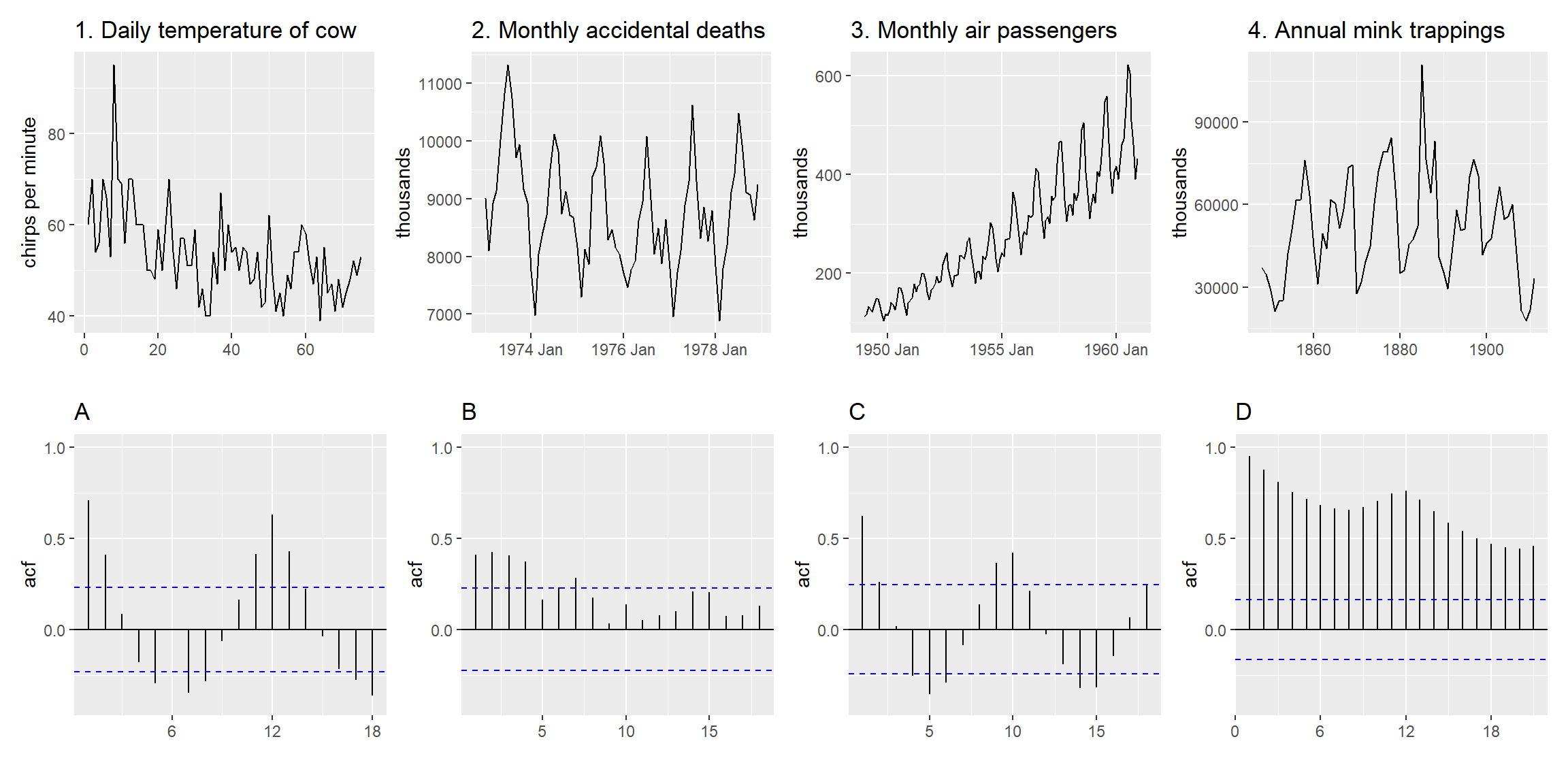
Which time plot corresponds to which ACF plot?
- You can compute and plot the daily changes in the Amazon stock price in 2018 using the code below. Do the daily changes look like white noise?
gafa_stock |>
  filter(Symbol == "AMZN", year(Date) >= 2018) |>
  mutate(trading_day = row_number()) |>
  update_tsibble(index=trading_day, regular=TRUE) |>
  mutate(diff = difference(Close)) |>
  autoplot()